
Selected Topics in Geoinformatics
Here I briefly discuss some current applied topics and areas of software development in the field of GIS.
These topics were introduced to me during my MSc Applied Geoinformatics. The discussion points are therefore based on the respective presentations given by various researchers.

Topic Overview:
Monitoring Urban Dynamics
In a presentation of Chaabane et. al's (2018) study on the extraction and classification of urban building footprints the practical uses of combining GIS with remote sensing software were highlighted. With the use of buffering techniques, extracted building footprints were classified to identify those buildings that are located within a defined critical proximity of urban waterbodies.
This case study provided an overview of a typical workflow for building footprint extraction. Starting with very high resolution Pleiades imagery that is segmented and classified using supervised classification techniques, the data is enriched with an array of auxiliary GIS data, including urban development plans and agricultural field maps, and even some additional remotely sensed drove (UAV) imagery.

I think the main emphasis, or take-away, from this case study has been the usefulness of information extraction, e.g. building footprint extraction, from remotely sensed data and using it for practical applications. The key seems to be the precise formulation of a rule-set defining which classes to extract and perhaps also their minimum size or location, and the subsequent combination with overlaid GIS data, namely a buffer-zone of rivers.
An honest question that remains from my side, or perhaps rather an afterthought, is what exactly the local government will make of this information. I suppose fining is an option. However it seems more useful to perform such analyses at a point in time prior to building construction, or rather prior to any approval of construction plans. It may be extremely useful for the local government to have such a map (both in printed hard copy and in an interactive web-based format) which delineates the given "no-building" buffer zone around water bodies so that it can be overlaid or compared with construction plans. Going forward I am sure this will be very useful.
This case study has offered a well-rounded sneak-peak into one of countless advantages that may be gained through the combination of remote sensing and GIS techniques.

Tourism, Environment And Big EO Data

This case study, kindly presented by Ms. Chu, was focused the links between human activity and changes to the coastal environment on Hainan Island in southern China.
The analysis was performed on Google Earth Engine and made use of indicators such as a vegetation index (NDVI), land surface temperature, and land cover classifications to make informed judgements about changes over time. By doing so, a first step is taken towards assessing the vulnerability of fragile ecosystems, including coral reefs, in the wider context of human activities.
The thoughts that this study provoked were threefold. Firstly, I wonder about the choice of indicators: Why only land surface temperature? In a study on changes to the coastal area, sea surface temperature in the region could also have been considered.
Secondly, a study such as this could be accompanied by an assessment of the correlation between land and sea ecosystems. Although that may exceed the intended scope of the study, I believe a holistic discussion is always appropriate. In order to associate human-related changes on land with changes in ecosystems that are, at least partly, in the sea, a discussion of this connection would be great. I.e.: What research is
out there that shows how the land-based activities analysed in this study impact the coastal ecosystem? Which indicators would really be best suited to analyse the correlation, and are they available to us through remote sensing? What
other factors may have a large impact, but haven't been included in this study?
Thirdly, this was my first, fascinating introduction to Google Earth Engine. The advantages of cloud-based storage, processing, and access of data appear obvious in a working environment that includes huge amounts of data, as is the case in remote sensing. This research exemplified the overall, gradual paradigm shift towards cloud-based computing in the geospatial field. As of yet, I have not had the occasion to work on Google Earth Engine and am only beginning to familiarise myself with programming. Hence, I am eager, curious, somewhat daunted, but very much looking forward to making use of this platform in the future.
Optimized Geodata Acquisition Practices for Municipal Applications
With regards to municipalities or governments, the challenge of staying up-to-date on the rapidly evolving internal and external usage demands of geospatial data appears to be a growing one. The speed of technological advances and the progress of digitalization have thus far not lost momentum.
The task of continuously implementing new technologies on a regional level is one that I am thankful I do not have. It surely requires cost-effective decision-making, weighting and judgement of what is essential, what will become more important in the future and what won't, how much will it cost to roll-out a new online infrastructure geared towards a certain data format... The list goes on. These questions are not easy to answer since future trends remain educated guesses based on what we know today. Nonetheless,

thankfully there are GIS units within municipal government bodies that are working to answer these questions, provide data, update geospatial infrastructures and help their citizens access the data they need.
This example was illustrated in the case of the Dubai GIS center, which is currently embarking on a transition phase to update their data acquisition methods. This is both necessary and desirable to achieve a "fitness" for future geospatial requirements of the municipality itself as well as its citizens and external bodies. Current outputs of the GIS unit are focussed on the creation of base maps or high resolution raster maps as a basis for further analysis, but also information products such as a greenery map or urbanization maps. These are products that can heavily benefit from advanced data acquisition techniques. As such, the department is making increasing use of very high resolution panchromatic and multispectral imagery that it obtains from the UAE's own KhalifaSat (launched 2018).
Beyond the use of satellite imagery, LiDAR technology is gaining importance for 3D mapping. For example, with mobile LiDAR systems mounted on cars, highly accurate models of urban areas can be generated. Also photogrammetry is making a "come-back" through the use of UAVs and advanced data processing technologies. To make such 3D data more accessible online and in a digital, interactive manner, the municipality is rolling-out a new "Dubai Here" app in which both 2D and 3D maps will be easily accessible.
I think it is clear that there are many benefits to be gained from an increasing presence and diversity of GIS data in the decision-making of local governments, since it offers a mostly objective perspective into what is, what can be, and what was. The main challenge will probably be the automation of data acquisition and processing, as well as the up-scaling of GIS infrastructure - not just internally, but as a municipal unit, also for their citizens. To integrate these efforts into a wider vision of "Smart Dubai" will likely be an advantage that allows more cross-sectoral involvement among the various municipal bodies.

[end]
Land Suitability Assessment in GIS: Application of an Urban Planner model
An app called Urban Planner is another example of how we might make use of a remote sensing-GIS combination. The topic of land suitability is a core element in urban and rural planning activities.

The three "pillars" of land suitability, according to the developer of this ESRI extension, Dr. Burian, are ecologic, economic, and social. Together they form a well-rounded concept of the umbrella term "suitability". The main analysis function is a multi-criteria analysis through weighted overlay. By weighting each suitability factor according to the user's priorities and intentions a variety of scenarios is visualised in the form of a colour-scaled raster to indicate high and low suitability. Also for each vectorised district an indication is given. Users can create a profile based on their own settings and preferences. This add-on in ArcGIS seems to be well geared towards answering some fundamental questions that government planners may have in the initial phase of development planning.
To address the inevitable question of accessibility upfront, Dr. Burian remarked that the ESRI environment was the chosen platform for this extension because the intended user group (governments) predominantly works on this platform. The data base which is accessed by this application is Czech national, open data. Although this particular software is geared towards analysis in Czechia, it has been tested for other countries as well.
I think this is a very useful application that can help guide decision-makers identify potential sites for all manners of development or construction projects. It seems to me to be most applicable for the initial planning phase, where a general overview of potential sites is generated. This initial phase would need to be followed-up by more flexible application that integrates specific location preferences, e.g. proximity to a very specific facility or a certain highway. This is by no means a critique of the Urban Planner application though, but more of a realisation that this one app alone cannot answer all questions that need to be addressed when determining a final site for any project.
Below is an interactive display of some suitability maps that are generated through the Urban Planner.
The Storymap: A Conversation-Starter through Effective Communication
The intention and main focus of story maps are clearly on presentation, communication, and interaction. This new format allows the user to manoeuvre through the presented geo-media on their own, making the communication participatory and engaging. Next to the conventional 2D top-down nadir view, a 2.5D perspective view is also offered. In terms of communication, this option is clearly a leap forward regarding the understandability of geospatial information since a perspective closer the ground is much more familiar and more relatable view.
An important issue raised by the presenter is the availability of geo-media for a wider audience. Thankfully, most geo-media is made accessible through creative commons licensing which allows for various degrees of data usage by the users. The benefits from using applications such as story maps to make geospatial information available to the public are obvious when considering the additional economic and innovative opportunities such information can create.
On a more critical and anticipatory note, I believe that more advancements for diverse editing and constellation options will be needed to keep pace with the rapid and extensive developments of geospatial analysis tools that are already being used in workflow steps. Examples might include a stronger integration of infographics and less hard separation of text and maps. Developments such as those are arguably foreseeable in the rather near future, as the field of geo-media is undoubtedly moving towards an ever-more interactive state. Importantly, it should become more interactive on both the behalf of the creators and the users to allow for creative presentations and to offer interactive communication as an experience for users.

Within the ESRI environment, story maps pose as a new online gateway between the ArcGIS workspace and a public audience. It serves as the final step of any workflow related to geospatial data, namely the presentation of the outputs. Whereas the conventional method has historically been, and largely continues to be, a static 2D PDF, image, or print-version of the final map, the story map web application offers a new alternative. As all areas of personal and professional life continue to gradually shift into a digital environment, it is hardly surprising that also a demand for more sophisticated digital map presentations has arisen.
Take a look at some of my own story maps (click on the title to see web page):

GeoDesign: A Powerful and Interdisciplinary Medium to look at Phenomena of Interest from different Perspectives
GeoDesign tools, such as those included in the ArcGIS Pro license, have often been praised for their abilities to model both real or hypothetical objects and phenomena. In its virtual setting, the physical world can be mimicked as it is in its current state, but also according to a historical state (provided enough knowledge and data about the historical context is given), and even in possible future scenarios.
It should be noted that the application of GeoDesign tools rely heavily on collaboration among various experts for the respective field of study. GeoDesign serves as the medium to represent, visualise, analyse, and predict phenomena in a specific field of interest, and as such, the content it aims to represent must be grounded in realistic scenarios. An obvious skillset required is that of geoinformatics or GeoDesign, however beyond that expert knowledge in areas such as architecture, infrastructure, climate change, landscape design, ecology, and countless others will be needed for any successful thematic implementation and usage of this powerful toolset. As such, the field of GeoDesign is a uniquely interdisciplinary domain.
Once this prerequisite of an adequate understanding of relevant processes, relationships, or underlying characteristics and dependencies of the field of interest is fulfilled, GeoDesign can truly open the doors to the future. We can adjust dependencies and relationships to design various “what if” scenarios, or we can use backcasting to approximate the necessary actions to take today if we are to achieve a specific goal in the future. Through a realistic perspective view we can visualise the future, which often serves (physically and metaphorically) as an eye-opener. It is likely that this tool will continue to gain importance as enabling technologies advance and familiarity with this concept becomes more widespread. It should be considered as a key research and communication tool for the likes of think-tanks or interdisciplinary research groups.
Creating 3D Visualisations: A Useful, yet too Exclusive and Expensive Toolset
Different levels of detail and realistic representations of real-world features offer a variety of application contexts. A highly detailed 3D map will mainly function as a "completed" map, and can thus be used for orientation purposes e.g. for tourism maps or for disaster risk mapping. A more basic, schematic map on the other hand can function as a starting point for users to add their own map content and so to personalise a custom 3D visualisation.
Along with these practicalities come a few remaining challenges that will need to be addressed to make perspective views more accessible to a wide audience of users. These include some obvious ones with minor payloads such as the amount of data that is generated, the restriction of the output to hardware with appropriate computing power (this may rule out the use on phones), or the evident time requirements for creating such a map. These are, as I have indicated above, comparatively minor disadvantages. They can all be addressed, diminished, or dealt with in an adequate fashion through appropriate planning, or foreseeable technological developments in soft- and hard-ware.
However, it can be argued that the main drawback is one that is much less likely to change with the steady advancements of technology. This is namely the exclusivity of these sophisticated tools. Currently, the most useful software tools can be accessed only in the environment of licensed, expensive software packages, such as ArcGIS Pro. On top of that, the acquisition of relevant data sets can be extremely hard to access, or even may need to be collected with UAVs or LiDAR technology.
The uses of a sophisticated and open-access 3D toolset may encourage a wide range of users to experiment and explore its many uses. I, for one, am a fascinated admirer of the visually engaging and (for lack of other, more sophisticated words:) cool presentation of 3D models. Since obtaining an ArcGIS Pro license I have occasionally experimented with the scene tools and created a very primitive 3D model of different 2D data sets, but found that I was compromised through lack of accurate data, computing power and further toolsets. Hence, my advocacy for more sophisticated open access tools is also a selfish one.
Of course, along with an open-access toolset, appropriate user-friendliness or training are required.

The rise in widespread interest, interaction, and recent developments in 3-Dimensional (3D) software tools is a testament to the many practical uses of 3D visualisations, otherwise called perspective views. Technological advances have opened the door to more sophisticated and user-friendly methodologies, as outlined by two researchers active in the research studio iSpace.
Spatial Energy Planning: Finding Optimal Energy Balances through Modelling
Today, our society is in the midst of an important process of moving away from fossil fuels and towards renewable energy sources. There is no doubt that this transition is a challenging one.
There are recent examples of power shortages across the globe that demonstrate how essential adequate planning is. As we start using sustainable resources for which we don't yet have immense storage capacities, peaks in energy demand can deplete the limited energy storage we have.


Decision-makers need relevant information on the bottle-neck factors for sustainable energy supply, the demand "hot-spot" locations, the energy efficiency of existing energy systems, and much, much more.
A current and highly relevant field of research is called "spatial energy planning", and is concerned with the optimization of our energy systems. It is a future-oriented method and is applicable on all levels between the household-level up to the regional- and national-levels. Its focus may be on the construction of the energy supply for new buildings or urban areas, or on an improved refurbishment of existing settlements.
Research teams are working on improving and automating the composite steps of such methodologies. One example starts with the creation of a comprehensive "building model". Existing buildings are evaluated for their energy efficiency through characteristics such as wall area, heating system, or area usage. A building used as a multi-family apartment with an out-dated heating system for example should be differentiated from a new office building. These attributes can be assigned to buildings in a GIS environment, where we may further visualise regional patterns.
Another important step is to match building footprints with addresses to assign energy efficiency values to easily relatable geospatial units with which it is can be more straightforward to work.
This appears to be a promising research endeavour. I only argue that these research teams should emphasise interdisciplinarity. A core aspect Spatial Energy Planning is the economics underlying feasibility of project implementation. Outputs generated should take cost-effectiveness into account. In particular if such methods should be used for sustainable urban energy planning.
Trajectories: The Analysis of Movement

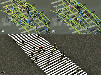
When we think about AI and self-driving cars, the navigation of airplanes, or even our everyday exercise routes, we know that the simulation of trajectories has some very specific application niches within which it holds a great amount of importance and value. By introducing the time dimension our our spatial analyses we open the doors to more complex
"relational geography".
In the GIS working environment however, this methodological toolset is arguably under-represented at the current time. I have no doubt that this will come, since the application cases are expanding, but the question is: will the tools be introduced first (out of innovation) and foster increased use, research and analysis, or will a demand for trajectory analysis push the development of tools? I think it's a balance between both. Already there are development such as the TrajAnalyst which pave the way for sophisticated analysis of movement.
Returning to the idea of expanding application cases, I would like to elaborate. Since more and more technologies are finding their way into the digital realm, and there are technological advances that allow the capturing of the time dimension, the amount of simulations that can be created is increasing accordingly. Besides the well established traffic analysis, and fitness-app applications, I am very interested to see trajectory analysis in GIS for more specific/ precision analysis such as automated driving, pedestrian movements and clustering, or broader-scaled analysis that analyse gradual movement over time e.g. animal migration patterns and how they change and coincide with other phenomena.
Trajectories can look back into past occurrences, or future-oriented scenario-models that project the direction and speed in which we are heading. This can be understood in a direct sense of object movement but also in a more metaphorical sense (which brings us back to the topic of GeoDesign - a way of simulating the future).
I am hopeful that I will have the opportunity to utilise trajectory analyses myself in the future.
Semantic EO Data Cubes: "Knowing What You're Looking At"
An exciting research project happening at the University of Salzburg and the University of Bern is concerned with the improvement of satellite imagery storage, search, and acquisition. To do that, they have created a data cube, "Sen2Cube". It's an earth observation data cube for all Sentinel-2 imagery in Austria.
A well-known source of frustration for remote sensing practitioners it the challenge of digging through large amounts of EO data to find adequate imagery for studies. Sen2Cube addresses this time-consuming task and makes the acquisition of

remotely sensed Sentinel-2 imagery much more accessible for both professionals and curious individuals who may not want to spend hours trying to find an interesting image. By defining an area of interest the system returns a collection of remotely sensed imagery and information products that it calculates on-the-fly for a user-defined time period.
The guiding idea is to "bring the user to the data", which is a very logical and practical new approach to the big data challenge. Search engines are becoming more advanced, and Sen2Cube is one exemplary showcase of how we may improve our access to data.
Recent Trends in Cartography: The Influence and Intentions of the Mapper

The topic of cartography will always be a current one, since it evolves in sync with any developments in relevant cartographic methodologies. That includes advances in digital visualization, digitization of data, and more diverse user engagement options... just to name a few.
The given presentation on current trends nicely differentiated between good, adequate and nice maps. This distinction is a highly relevant one, which I have also put much thought into in the context of my own projects or work. At the heart of the matter lies the intention of the mapper who inevitably send an array of messages and communicates with the users in various obvious and not-so-obvious ways.
Ever since the dawn of maps, the symbology and presentation has always carried with it some implications about the content a map is representing. Obvious examples thereof include the choice of colour-schemes. The same concerns apply as we move into an increasingly digital domain. Perhaps even more so, since there are now many more ways in which we (mappers) can subtly influence the message of our geospatial products, and these ways may be less obvious to the user. Examples include our choices of visual effects, animation, "guided tours", and so on. While these are extremely useful new cartographic tools, which allow us to integrate more data and create a more holistic view of a given subject, we have a duty to also "upgrade" our awareness of the influence maps exert. As the creativity of the mapper unfolds, so does his/her ability to influence the underlying messages that are being sent. It is a matter to be cautious about.
We should think about the spatial nature of data and appropriate ways of representing it. An interesting example that was mentioned included the geographic display of voting results, which didn't satisfactorily incorporate the high population densities in urban areas - thereby creating a skewed and misleading representation.
We should consider the spread of the phenomena and the factors that influence it. Transparency is key here. Since there is no "one true map", we need to be absolutely truthful about the intentions and limitations of the maps we create. This way we can ensure that our maps are not misleading but can be used in the way they are meant to:
to provide insights, to provoke thoughts, to create discussions, and to inform decisions.